Home page
Inbound Email Activity
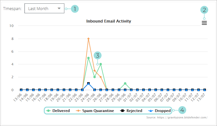
Timespan - Change how far back email activity will be displayed.
Chart Context Menu
Print Chart
Download PNG image
Download SVG vector image
Download JPEG image
Download PDF document
Download from server - this sends an email with a PDF version of the chart to a chosen recipient
Save - save the current report with the chosen filter.
Save as - use this when you have already saved the report and want to save the currently displayed one under a different name.
Chart - the chart is a graphical day-by-day visual representation of inbound email activity. It displays the below values:
Delivered - number of emails safely delivered to company users
Spam Quarantine - number of emails flagged as spam and quarantined
Rejected - rejected messages
Dropped - dropped messages
Note
Clicking on any of these values in the chart will direct you to the Analytics page where it will display the report relevant to the value you selected.
Legend - it describes what value each colored line represents.
Note
Clicking on a value will remove/add it to the chart.
Top Final Rules
This chart provides a visual representation of the most commonly applied final rules to messages over a specific period of time.
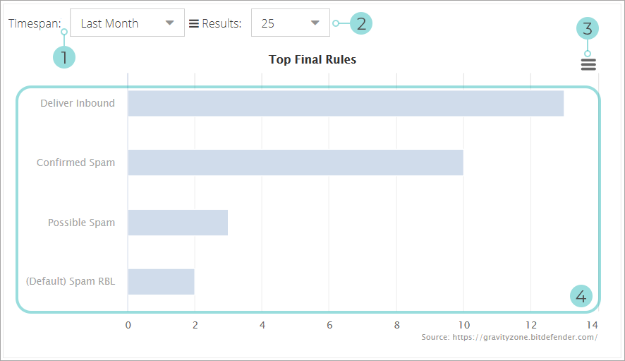
Timespan - Change how far back email activity will be displayed.
Results - Change the maximum number of results the chart will reference all values to.
Chart Context Menu
Print Chart
Download PNG image
Download SVG vector image
Download JPEG image
Download PDF document
Download from server - this sends an email with a PDF version of the chart to a chosen recipient
Save - save the report with the currently selected filters and settings for use at a later date
Save as - can be used when opening an already saved report to save a variation of the original.
Chart - shows a comparative graphical representation of the most commonly triggered final message rules.
Note
Clicking on any of the rows will open a new tab with an email activity report specific to that value.