Accessibility features
The design and operation of GravityZone take into account the accessibility criteria defined by the Web Content Accessibility Guidelines 2.2 (WCAG 2.2). GravityZone targets the AA conformance level of the WCAG 2.2 guidelines. For more information on WCAG 2.2, refer to the official WCAG 2.2 web page.
Selecting an improved accessibility theme
The GravityZone Control Center provides two interface themes with improved accessibility:
The dark theme reduces eye strain and glare, contributing to a more accessible user experience for users with light sensitivity, visual impairments, or certain reading disorders.
The high-contrast theme displays colors with increased text legibility and reduces visual strain for users with low vision or photosensitivity.
To change the interface theme, take the following steps:
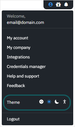
In the top-right corner of the GravityZone Control Center, select User menu.
In the user menu, locate the Theme selector and select the desired theme.
Note
Selecting System theme (default) applies the default color theme set at the operating system or browser level.
On Windows, selecting the high-contrast theme overrides the browser settings and applies the theme to the GravityZone Control Center. On macOS, the high-contrast theme only applies to the browser layout, not to the GravityZone Control Center.